
A Strategic Guide to Calls-to-Action (CTAs) in Email Marketing: Best Practices for Success
Every email has a purpose. Whether it’s to inform users of a product update, an upcoming event, or the latest offers—every campaign should have a primary goal. In most cases, the goal is to get subscribers to do something.
Enter: calls-to-action (CTAs). CTAs help guide your subscriber to the primary action you want them to take.
In this blog, we’ll cover CTA best practices, including:
Guide to Calls-To-Action (CTAs) in Email Marketing
Discover the art of crafting compelling CTAs with tips on copywriting, design strategies, and providing a seamless subscriber experience.
Why is a call-to-action important?
While some email campaigns exist purely for entertainment or educational reasons, most campaigns are used to market something—a product, service, or event. As email marketers, we need our subscribers to buy those products, subscribe to those services, and register for those events. And the only way to accomplish that is by getting subscribers out of their inbox and onto a landing page.
Sending great content and hoping that a subscriber remembers you is not enough (although that helps). You need subscribers to take action immediately, and CTAs are the way to do that.
As email marketers and designers know, there’s more to conversions than simply adding a button to your email. We’ll go over some guidelines to keep in mind when you’re designing and implementing CTAs to your emails that will help improve your success.
Designing calls-to-action
A good CTA doesn’t just stand out—it highlights the value of what happens, beyond the click. Let’s dive into considerations when it comes to designing CTAs.
Define the purpose
Just like an email needs a purpose, so does a CTA. Sure, the purpose is to get subscribers where you want them to take action. But by asking yourself the following three questions, you can get beyond the superficial and figure out the real purpose behind your CTA:
- What do I want a subscriber to do?
- How will they know what to do?
- Why should they do it?
Every CTA should provide value for the subscriber. Whether or not it is explicitly stated, it should be clear exactly what they get for investing their time in your email and landing page. These questions help to clarify that value and, once answered, you can start thinking about how best to convey that value proposition in a CTA.
Consider your language
There are two main parts to any CTA: the language and the design.
While the design helps draw the reader’s eye and makes it easy to use, the language in the CTA is what convinces a reader to interact.
To help illustrate what constitutes an effective CTA, let’s break down some common ones:
- Click here
The biggest mistake that marketers make is using weak, passive language in their CTA. A classic example is the infamous “click here”. While “click here” may seem like a great CTA (in that it tells a subscriber exactly what to do), it really doesn’t give a reader any incentive for taking action. It doesn’t describe the value or what will happen if, in fact, they do click the link. As an alternative, you should use language that describes why a user should follow a link. Use verbs to describe what they will do by interacting with the CTA and, if possible, create a sense of urgency or timeliness.
- Buy now
Some CTAs (like “buy now”) infer a greater commitment on behalf of the subscriber—you’re asking them to spend their money by clicking the button. On the contrary, “shop now” represents a much lower commitment.High commitment propositions, like alluding to spending time or money, can be scary for a medium as casual as email. Instead, focus on low-commitment propositions that don’t require a huge investment from your subscribers.
Instead of going for a “click here” or “buy now,” consider verbs that tease your CTAs. Your button text should set the expectation for what your subscriber will encounter after they click.
Here are some examples of more descriptive, enticing calls-to-action:
- Shop fall collection now
- Access your account
- Get 50% off today
- Start testing
- Learn more
- Start planning
- Show me how
- Run faster
Learn more about this in our conversion-centered design (CCD) blog post.

Ensure your CTAs are a home run
Get automatic notifications when a broken or slow-loading link is detected, so you can fix it before it reaches your subscribers with 24/7 Link Monitoring in Litmus Email Guardian.
Think about size & placement
After you have nailed down the language for your CTA, it’s time to think about its size and placement.
Mobile is the top way to read email, with 44.7% of opens taking place on a mobile device or client. As mobile continues to gain popularity, the physical size of CTAs are more important than ever. While clicking a link with your mouse on a desktop provides very precise control, touching a CTA with your thumb can become frustrating when targets are too small or cramped too close together on mobile devices.
Generally, you’ll want to keep CTAs big enough for even large thumbs to easily tap. Apple suggests making touch targets at least 44×44 px. We recommend that as a great starting point when designing any CTA.
Whitespace
Along with making CTAs big enough, you need to provide generous spacing around them—aka, whitespace. This makes your CTA easier to find. Including whitespace around CTAs also prevents subscribers from getting frustrated when they attempt to tap one link and get another.
Let’s look at this example from DataCamp:

What makes these CTAs effective? First is the generous padding provided, from the block and the CTA button. Second is the center positioning of the button. Together, these techniques help guide the eye.
It can also help to repeat your primary CTA further down in the email. Enthusiastic scrollers may miss the first one and the repetition helps to add weight to your CTA and reinforce its importance.
Make your CTA stand out with contrast
Finally, when designing any CTA, it’s important to think about how it will contrast with surrounding content.
Using color is a great way to add contrast. Vibrant colors are generally best at drawing the eye to the CTA. Even if you use muted colors for your CTAs, they need to contrast with any background colors, images beneath the CTA, or surrounding text.
Take the following examples. Which email draws your attention?


Learn more about contrasts in our conversion-centered design blog post.
Types of calls-to-action
Generally speaking, every email you send should have a primary goal. But what about when you have more than one CTA?
Primary CTAs
Your primary CTA is the main action you want your subscriber to take. It should be the most prominent in your email and styled in a way to help it stand out.
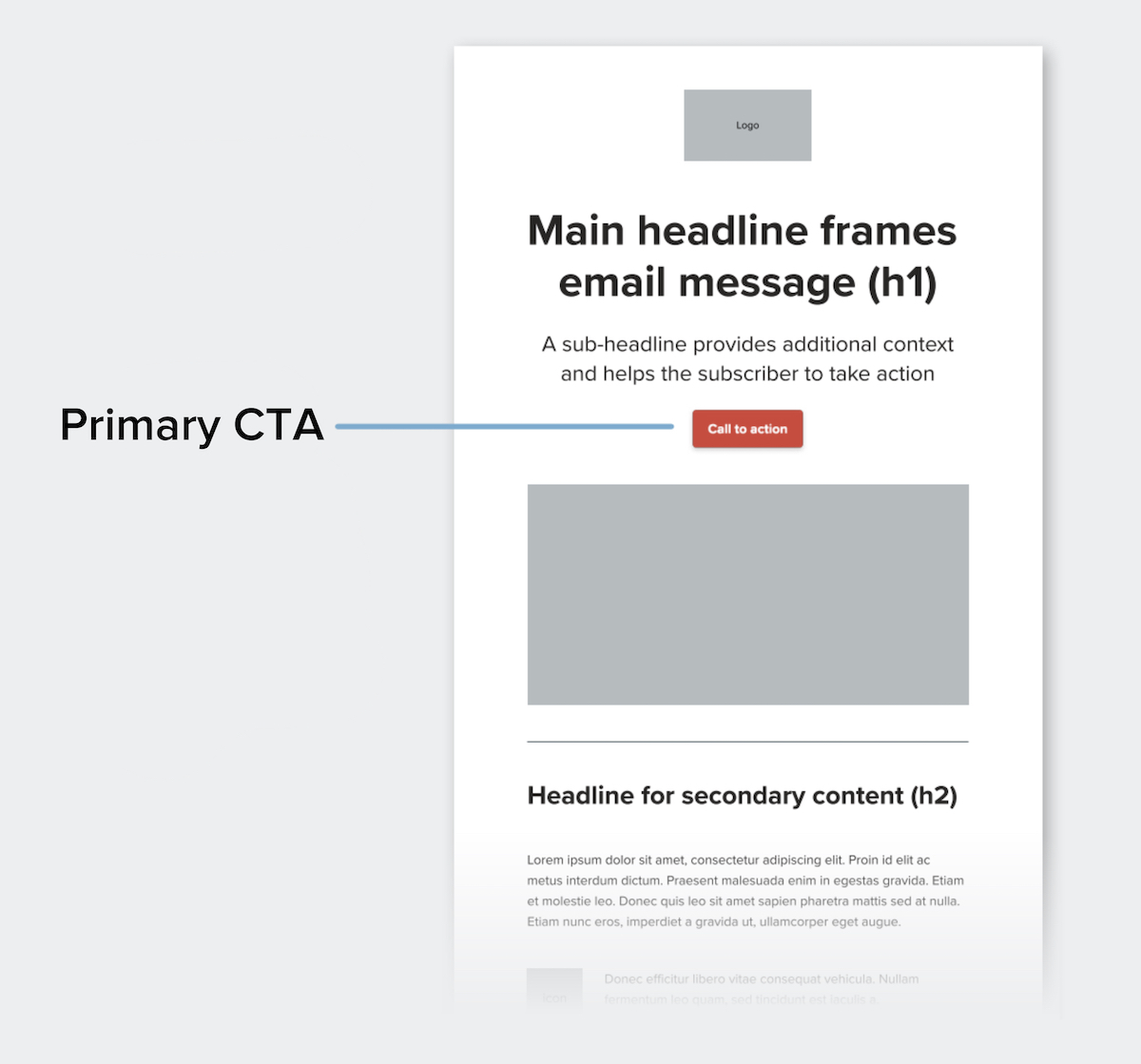
One of the key ways to help your primary CTA stand out is by applying whitespace: space that is uninterrupted by other elements.
In addition to whitespace, you can help your primary CTA stand out by:
- Styling your primary CTA as a button
- Making your button a different color than the other design elements
- Using typography, such as larger or bold text
You want your primary CTA to be seen quickly, too. Placing your most important CTA early in the email is a good way to ensure this. While some might argue that the fold doesn’t exist on mobile, keeping your primary CTA towards the top of your campaign accounts for readers that are not likely to scroll.
Secondary CTAs
After primary CTAs, any additional actions you want your subscriber to take are secondary CTAs. These should be styled in a less dominant way.
By styling your primary and secondary CTAs differently, it prevents them from competing with each other. To achieve this, you can still offer a button, but opt for a muted style—such as a color that isn’t as bold or a white button with a color border, shown below.
Here are some examples:

You can also simply offer a styled text link, which we’ll cover in the next section.
Styling CTAs
There are several ways you can style your CTAs to help them stand out in your designs. The following are a few methods that can be applied to help subscribers more clearly identify your CTAs, whether they’re primary or secondary CTAs.
Styled text links
Designers typically don’t have the same level of control over text links as they do with images and buttons. Design techniques—such as adjusting the size of a link within a block of copy or increasing the space surrounding text links—aren’t as effective and can sacrifice the design of the email. Therefore, color and font weight are the most important tools when dealing with text links.
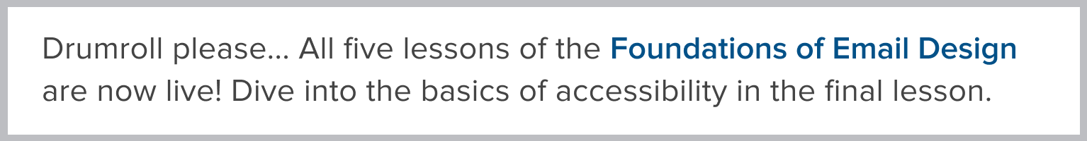
For a styled text link to be effective, you should consider two things: 1) the text should be a different color from the primary copy and 2) it should be underlined. This will help subscribers recognize it as a clickable element to help them take action.
Compare the two blocks of copy below—by stylizing with a bolded font weight and color, the “Foundations of Email Design” styled text link stands out more as a clickable element.

To help your link stand out more, another approach is to add a rollover effect, which we’ll cover next.
Rollover effect
A rollover effect is a visual effect that helps highlight when an element is clickable. These can be applied to text links, buttons, and imagery.
For text links, rollover effects that can be used are a color change or stylizing of text. In the example below, the underline disappears on rollover.

For buttons, the colors change on rollover. In this example from our newsletter, you can see that a more muted color combination is applied as the rollover effect.

Want to see more rollover effects in action? Check out our newsletter in action and hover around the buttons, links, and imagery.
Bulletproof buttons
Bulletproof buttons are CTA buttons built with code instead of images. By only using code, the button will display in all email clients even when images are turned off, which is what makes them “bulletproof.”
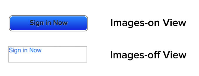
Bulletproof buttons consist of live text styled to look like image-based buttons. They’re the best way for designers to use button CTAs in their emails. Not everyone is able to (or willing to) dive into VML code, though. (And that’s why we created our step-by-step guide to bulletproof buttons in email for everything you need to know—code included.)
Guide to Calls-To-Action (CTAs) in Email Marketing
Discover the art of crafting compelling CTAs with tips on copywriting, design strategies, and providing a seamless subscriber experience.
The destination URL
The destination URL is the final step in the CTA journey, leading subscribers to your email’s main goal. Making sure this experience is smooth is key!
Tracking your links
To get the most out of your clicks, track your email engagement with Urchin Tracking Modules (UTMs) parameters.
According to Google:
By adding utm campaign parameters to the destination URLs you use in referral links and ad campaigns, you can see which campaigns refer traffic. When a user clicks a referral link, the URL parameters are sent to Analytics and the parameter values are visible in the Traffic acquisition report.
Simply put, UTM parameters help you track how people find and engage with your content, letting you understand their journey from discovery to signup, whether it starts on social media, moves to your blog, and ends with a form completion.
Ensure you set up tracking to capture all the important click data!
Inside look: How UTM parameters work at Litmus
In our Litmus Weekly newsletter, we track clicks on the same link from two different sources: the hero image and the headline. By tagging the image link with utm_content=hero and the headline link with utm_content=headline, we can precisely identify where our readers are clicking.

How many CTAs are too many?
A strong point of contention between designers is just how many calls-to-action should be included in an email. Retailers generally include dozens of CTAs, the theory being that at least one of them will be of interest to a subscriber. However, many marketers like to focus on one or two CTAs in an attempt to make them more significant for subscribers.
Of the below call-to-action email examples, which strategy works best?


We say this a lot when talking about email but—it depends. Including a ton of links can appeal to a wide variety of subscribers but can dilute your message. One CTA can hone your message, but may exclude a large number of subscribers that aren’t interested in that particular message.
You need to find a balance and strategy that works for your audience. One of the best ways to do that is through testing.
Testing your CTA
There are a number of useful things to test to increase the effectiveness of CTAs. As mentioned before, you will want to test the number of CTAs to determine what works best for your audience.
Another idea is to test the language, color, design, and type of link. You may think that a bunch of huge, colorful buttons would work for your campaigns but you may find that your readers prefer a few simple text links instead.
Always test and rely on email campaign data to find what works best.
Put it in action!
As email marketers, we can get lost in implementing a design and lose sight of the entire lifecycle of a subscriber, especially outside of the inbox. Keep your CTA descriptive, timely, easy to find, and easy to interact with. Above all, promise your subscribers real value and keep that promise even after they leave their inbox.
If you follow these guidelines, not only will your subscribers thank you, but the return on your email campaigns will likely increase as well.
Ensure your CTAs are a home run
Get automatic notifications when a broken or slow-loading link is detected, so you can fix it before it reaches your subscribers with 24/7 Link Monitoring in Litmus Email Guardian.
Originally published on February 4, 2012 by Jason Rodriguez.
Kimberly Huang
Kimberly Huang is a Content Marketing Manager at Litmus